When it comes to branding, colours aren’t just aesthetic choices; they are powerful psychological tools that influence how consumers perceive and interact with your brand. At Kodo, we understand the subtle yet profound impact of colour psychology on consumer behaviour. Here’s a dive into how colours can shape brand perception and decision-making.
The Science Behind Colour Psychology
Colour psychology examines how hues affect emotions, behaviours, and decision-making. Different colours can trigger specific feelings and associations, influencing how people react to brands and products. It’s no coincidence that many food brands use red to stimulate appetite or that tech companies favour blue to convey trust and reliability.
The Emotional Spectrum of Colours
- Red: Passion, excitement, urgency. Often used to grab attention (think sale signs).
- Blue: Trust, security, calmness. Popular among finance and tech brands for conveying reliability.
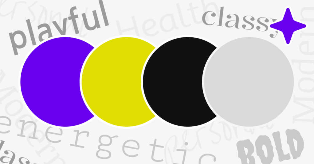
- Yellow: Optimism, warmth, clarity. Great for capturing attention and evoking cheerfulness.
- Green: Health, tranquillity, growth. Frequently used by eco-friendly and health-focused brands.
- Purple: Luxury, creativity, wisdom. Associated with premium products and imaginative brands.
- Black: Sophistication, power, elegance. Common in luxury fashion and high-end products.
- White: Simplicity, purity, cleanliness. Often used in minimalist designs and healthcare branding.
How Colour Influences Consumer Decisions
- Brand Recognition: Studies show colour improves brand recognition by up to 80%.
- Emotional Connection: Colours evoke emotional responses that can build strong connections with your audience.
- Perceived Value: The right colour palette can position your brand as premium or budget-friendly.
Choosing the Right Colours for Your Brand
- Understand Your Audience: Consider the cultural and emotional associations your target market has with colours.
- Align with Brand Personality: Your colour scheme should reflect your brand’s values and message.
- Test and Adapt: Use A/B testing to see how different colour schemes perform with your audience.
Kodo’s Approach to Colour in Design
At Kodo, we don’t just pick colours because they look good; we strategically select palettes that resonate with your brand identity and influence your audience effectively. Our expert designers ensure that every hue, shade, and tone aligns with your brand’s goals.
Ready to transform your brand with the power of colour? Contact Kodo today and let’s create designs that not only look stunning but also drive consumer engagement.
Email Kodo Design and let’s get talking – info@kododesign.co.uk

Leave a comment