When you’re planning a new website for your business, you’ll probably hear the terms responsive design and adaptive design thrown around. Both have to do with how your website looks and functions across different devices — but they’re not the same thing.
If you’re wondering which approach is better for your small business website, this post breaks down the key differences, pros and cons, and how to choose the right one for you.
First, why does it matter?
These days, most people visit websites on their phones. In fact, mobile traffic makes up more than half of all website visits worldwide.
That means your site needs to look great and work smoothly — whether someone’s using a laptop, tablet, or smartphone. That’s where responsive and adaptive design come in.
What is Responsive Design?
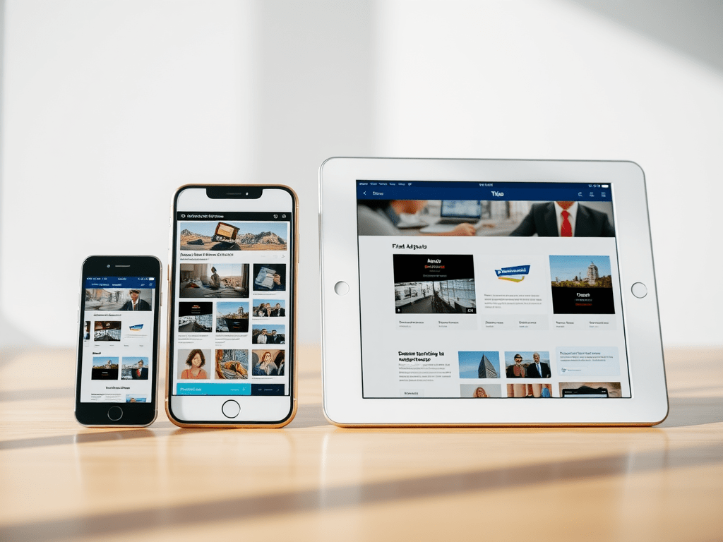
Responsive web design uses a fluid, flexible layout that automatically adjusts to fit any screen size.
Instead of designing multiple versions of your site, you create one layout that “responds” to the user’s device.
In simple terms:
Responsive design = one website that resizes and rearranges itself seamlessly.
Benefits of Responsive Design:
- ✅ Works on all devices (future-proof)
- ✅ Easier to maintain — one design to manage
- ✅ Better for SEO (Google recommends it!)
- ✅ Creates a consistent experience for users
When to choose it:
If you want a website that looks polished on every screen and is easy to update, responsive design is usually the best option. It’s ideal for small businesses that want a professional, reliable, and cost-effective website.
What is Adaptive Design?
Adaptive web design, on the other hand, involves creating separate fixed layouts for specific screen sizes — for example, one for desktop, one for tablet, and one for mobile.
When someone visits your website, the design “adapts” by loading the version that best fits their device.
In simple terms:
Adaptive design = multiple layouts that adapt to specific screen sizes.
Benefits of Adaptive Design:
- ⚡ Optimised for each device type
- 🎯 Allows more control over design and performance
- 💡 Can load faster for certain devices
When to choose it:
Adaptive design is often used for large, complex sites where performance and control are key. For example, e-commerce platforms or apps that need tailored layouts for different devices.
Responsive vs. Adaptive: Which is Better for Your Business?
Here’s a quick side-by-side comparison:
| Feature | Responsive Design | Adaptive Design |
|---|---|---|
| Layout | Fluid and flexible | Fixed, device-specific |
| Maintenance | Easy (single layout) | Time-consuming (multiple versions) |
| Performance | Consistent | Can be faster for certain devices |
| SEO | Excellent (preferred by Google) | Requires extra optimisation |
| Cost | More affordable | Typically higher upfront cost |
For most small businesses, responsive design is the clear winner.
It’s flexible, budget-friendly, and ensures your site always looks great — no matter what device your audience is using.
Kodo’s Take: Focus on Your Users
At Kodo, we design responsive websites that look great and perform even better.
Our goal is simple: to create websites that adapt beautifully to every screen, while telling your brand’s story in a way that feels authentic and engaging.
Whether you’re refreshing an old site or starting from scratch, we’ll help you build a responsive website that connects with your audience and grows your business.
Need a website that works everywhere?
Let’s make it happen.
👉 Get in touch with Kodo today to start your responsive web design project.


 Kodo Design