Tag: branding

  • Logo vs Brand Identity: Why Your Business Needs More Than Just a LogoWhy a Logo Alone Isn’t Enough for Your Business

    Logo vs Brand Identity: Why Your Business Needs More Than Just a LogoWhy a Logo Alone Isn’t Enough for Your Business

    Designers—including myself—are often asked to “design a logo.” And yes, of course, I can design a logo for you. But here’s the truth: I’d much rather design an identity for you.

    Too often, people confuse a logo with the identity itself. A wordmark or symbol is created, and the assumption is that the brand is complete. Don’t get me wrong—logos are important and can absolutely do the job…for a while. But what about everything else? What about the details that make your brand memorable? The atmosphere, the feeling, the experience?

    How does a logo alone carry all of that?


    The Difference Between a Logo and a Brand Identity

    A logo is the part of branding people focus on the most, and for good reason—it’s a recognizable marker of your business. It’s what we hope people will remember, like the bitten Apple or the Nike Swoosh.

    But here’s the catch: a logo can be replicated, altered, or imitated. Think about those cheap logos on Fiverr—change a word, swap a color, and suddenly your “unique” logo isn’t so unique anymore. So, what really sets your brand apart?

    It’s everything else.


    What Brand Identity Really Looks Like (Hint: It’s More Than an “M”)

    Take McDonald’s. Chances are, you instantly pictured the Golden Arches. Maybe the bold red and yellow color palette. But what else came to mind?

    • Their fries?
    • A Big Mac or a Philly Cheese Steak burger?
    • The wood-paneled interiors paired with bright, playful accents?
    • The menu boards, the staff uniforms, even the icons for payment and drive-thru?

    That’s brand identity.

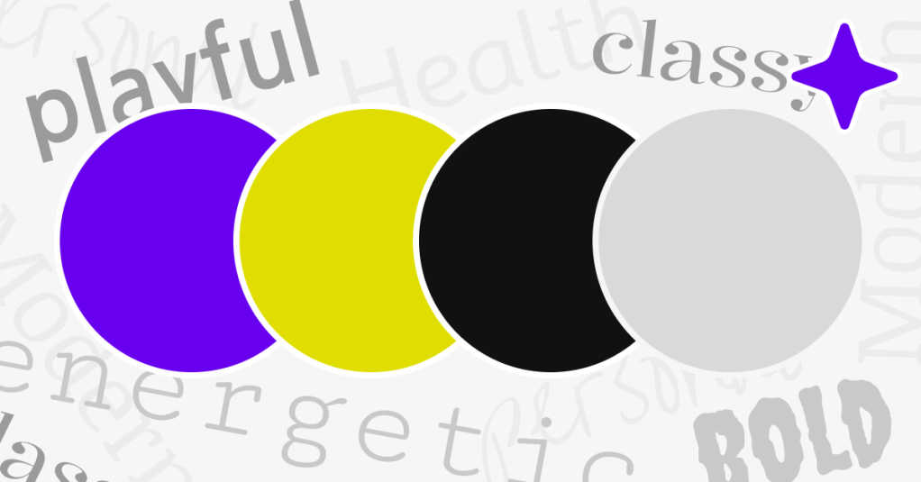
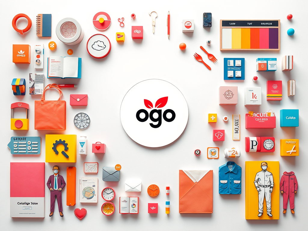
    A logo is just the starting point. A brand identity is the entire experience—both in person and online. It’s the color psychology that shapes emotions (red for affordability, yellow for playfulness). It’s the textures, typography, and design systems that create consistency across every touchpoint.

    Think about it this way: if you’re opening a restaurant, the brand doesn’t stop at the sign outside. It’s in the menu design, the napkins, the staff uniforms, the receipts, the website, even the wayfinding icons in the car park. Every little detail adds up to create an impression—positive or forgettable.


    Why Investing in Brand Identity Matters

    A logo might get you started, but a cohesive brand identity allows your business to grow, scale, and stand apart. It ensures that every interaction feels intentional, memorable, and uniquely yours.

    So yes, we can start with a logo. But together, we can build something much more powerful: a brand identity that creates connection, builds trust, and makes your business impossible to ignore.


    Ready to Build Your Brand Identity?

    If you’re ready to take your business to the next level, let’s design an identity that does more than just “look good”—let’s design one that works hard for you at every touchpoint.

    📩 Email me at info@kododesign.co.uk and let’s arrange a call.

  • Colour Psychology – What Your Brand is Subconsciously Saying to Customers

    Colour Psychology – What Your Brand is Subconsciously Saying to Customers

    When it comes to branding, colours aren’t just aesthetic choices; they are powerful psychological tools that influence how consumers perceive and interact with your brand. At Kodo, we understand the subtle yet profound impact of colour psychology on consumer behaviour. Here’s a dive into how colours can shape brand perception and decision-making.

    The Science Behind Colour Psychology

    Colour psychology examines how hues affect emotions, behaviours, and decision-making. Different colours can trigger specific feelings and associations, influencing how people react to brands and products. It’s no coincidence that many food brands use red to stimulate appetite or that tech companies favour blue to convey trust and reliability.

    The Emotional Spectrum of Colours

    • Red: Passion, excitement, urgency. Often used to grab attention (think sale signs).
    • Blue: Trust, security, calmness. Popular among finance and tech brands for conveying reliability.
    • Yellow: Optimism, warmth, clarity. Great for capturing attention and evoking cheerfulness.
    • Green: Health, tranquillity, growth. Frequently used by eco-friendly and health-focused brands.
    • Purple: Luxury, creativity, wisdom. Associated with premium products and imaginative brands.
    • Black: Sophistication, power, elegance. Common in luxury fashion and high-end products.
    • White: Simplicity, purity, cleanliness. Often used in minimalist designs and healthcare branding.

    How Colour Influences Consumer Decisions

    • Brand Recognition: Studies show colour improves brand recognition by up to 80%.
    • Emotional Connection: Colours evoke emotional responses that can build strong connections with your audience.
    • Perceived Value: The right colour palette can position your brand as premium or budget-friendly.

    Choosing the Right Colours for Your Brand

    1. Understand Your Audience: Consider the cultural and emotional associations your target market has with colours.
    2. Align with Brand Personality: Your colour scheme should reflect your brand’s values and message.
    3. Test and Adapt: Use A/B testing to see how different colour schemes perform with your audience.

    Kodo’s Approach to Colour in Design

    At Kodo, we don’t just pick colours because they look good; we strategically select palettes that resonate with your brand identity and influence your audience effectively. Our expert designers ensure that every hue, shade, and tone aligns with your brand’s goals.

    Ready to transform your brand with the power of colour? Contact Kodo today and let’s create designs that not only look stunning but also drive consumer engagement.

    Email Kodo Design and let’s get talking – info@kododesign.co.uk

  • Why the Right Font Makes A World of Difference

    Why the Right Font Makes A World of Difference

    Why The Right Font Makes A World of Difference

    In the world of design, the right font is as crucial as the imagery you choose or layout. It’s often said that a picture is worth a thousand words, but the right font can be equally powerful, providing the perfect visual voice for your content, setting the tone without saying anything at all. At Kodo Design, we believe that typography is a fundamental element that can make or break a design. Here’s why choosing the right font makes a world of difference.

    Fonts Set the Tone

    Fonts have personality. A serif font might convey tradition and reliability, like the pages of an esteemed newspaper. Meanwhile, a sans-serif font might suggest modernity and simplicity, perfect for tech companies or forward-thinking brands. Script fonts, with their elegant curves, could be ideal for a wedding invitation or a luxury brand. Selecting a font that aligns with your brand’s voice is essential in setting the correct tone for your audience. This isn’t to say that you can only choose one typeface for your brand. By pairing typefaces together (serif and sans-serif) you can further develop your brand identity. 

    Enhance Readability and Accessibility

    One of the primary functions of typography is to ensure readability. The right font can make text easy to read, ensuring your message is accessible to everyone. Factors like font size, spacing, and weight must be considered to enhance visibility and legibility for your audience. At Kodo Design, we always ensure our font choices prioritise accessibility, working with the WCAG Global Accessibility Guidelines, creating designs that are inclusive and user-friendly. If you’re wanting to use a more decorative typeface for your brand, when it comes to bodies of text, try only using the decorative font for headings and use a more simplistic font for the body text to ensure that the user can easily read the content whilst still communicating your brands visual style. 

    Establish Brand Identity

    Your font choice is a critical part of your brand identity. Just as colours and logos do, fonts help create a cohesive brand aesthetic. Consistent use of typography across all platforms and materials strengthens brand recognition, allowing audiences to instantly associate the font with your brand. Choosing a unique or custom font could even set your brand apart from competitors. 

    Emotional Impact

    Fonts can evoke emotions and influence how your message is perceived. A bold, heavy typeface might create feelings of strength and urgency, while a delicate, light font could convey elegance and sophistication. Selecting the right font can subtly guide consumers’ emotions and reactions, aligning them with your brand’s message. Choosing the wrong font for your brand can completely alter the messages that you’re trying to share with potential clients and customers. Think if Tiffany & Co used Comic Sans as their font! It would’t give the established and luxury vibe to the brand or its products. 

    Create Hierarchy and Structure

    Typography is vital in establishing visual hierarchy within a design, allowing for ease of navigation, understanding and reduces stumbling blocks or irritation whilst viewing/reading. Different font styles, sizes, and weights can guide the reader’s eye, helping them navigate information efficiently. By distinguishing headings, subheadings, and body text, fonts can create a clear and organised structure, enhancing comprehension and retention of information. This gives your messages much more power and impact when used effectively. 

    Conclusion

    At Kodo Design, we know that the right font choice can elevate a design, adding depth, personality, and clarity to your message. Whether you are rebranding, creating a new website, or launching a campaign, paying attention to typography can significantly impact your brand’s success. Explore the world of fonts with us, and discover how the perfect choice can make all the difference in your business. As part of our Brand Identity package, along with a logo and colour scheme, we explore the typeface possibilities that would suit your brand and your business. Contact us to see how we can help support your business and drive success. 

    By understanding the nuances of typography, you can harness the power of the right font to enhance your brand’s message and achieve your marketing goals. Let us at Kodo Design help you in crafting designs that not only speak your visual language but also resonate with your audience.